Freelance SEO Essex Launches New-look Website!
Welcome to the new Freelance SEO Essex website! What do you think of our new look?
A lot of time, effort and planning has gone into our new platform, so we really hope you enjoy browsing the site, checking out our web design portfolios and having a read of our client case studies.
Big Changes
We’d stuck with our previous website for 4 whole years, but after a lot of deliberating, we felt it was time to freshen up our brand and introduce some new features to the platform. It was a big decision – after all, the previous template had always converted well and was widely praised by our client base – but, as they say, it was well and truly time to throw out the old and eagerly embrace the new.
We know that the new design still needed to provide our visitors with a wealth of information on our services. But unlike many of our competitors, we wanted to avoid using cheesy graphics and animations to keep the site up-tempo, and instead focus on streamlining the user journey and maintaining the quality of the content that’s being delivered. After all, content is still king when it comes to attracting (and retaining) the attention of any audience.
Reviewing The Old Website
Due to the nature of our industry, prospective SEO clients often want to read an insight into the work that they can expect us to carry out on their behalf. The team here at Freelance SEO Essex have always been extremely transparent and upfront with regards to our methods and practices, and we certainly didn’t want to lose this authentic edge by removing valuable copy from the site. We know that many people are tired of being promised the earth and receiving very little, so we’ve always made it our mission to educate our clients and reassure them that we take a distinctively different approach towards SEO.
That said, most users want to find specific snippets of information quickly and easily, and they don’t want to skim-read through reams of text to find what they’re searching for. Our developers needed to create a design that was easy to navigate yet still packed full of all the insightful content that is highly appreciated by our audience.
When we looked through our Analytics data, we found that our most visited pages were our Case Study and Portfolio pages. The Meet the Team section was the third most popular internal page. It was clear to us, then, that our prospective customers were keen to learn more about our work, our approach and our staff before getting in touch.
For this reason, we felt it was important to display our Google Partner status more prominently on the site to communicate our professionalism and commitment; we have also made sure that our excellent client reviews are clearly on show so that there is no doubt in our users’ minds that we’re a great fit for their business.
Analysing Our Audience
After a team brainstorm, we decided that the Freelance SEO Essex website typically receives three types of visitors:
#1: The Researcher
The first type of user is someone who wants to have a good look at the website and spend some time checking out our existing clients and case studies. Once they are happy with what they’ve seen, they will then feel comfortable enough to send a detailed breakdown of their business requirements and campaign history using our contact form and/or the prominent email address that’s displayed across the website.
#2: The Quick Quoter
To the second type of visitor, time is of the essence. They are likely to be comparing what’s on offer from different agencies, and they want to quickly request a call back by submitting their name, number and URL via our Quick Quote form, which can be found in the top right hand corner of every page on the new site.
#3: The Talkative Enquirer
The third type of visitor loves to chat. This person wants to call and speak to one of our experienced SEO consultants personally to find out more about what we can offer. To attract these kinds of users, we ensured that our telephone number was clearly displayed across the header and in various other locations across the whole of the website.
Our Key Design Changes
We’ve overhauled our logo and given it a slicker, more corporate feel. A modern typeset and a revamped target icon have produced a moniker that’s much more 2018.

It’s now easier than ever to get your hands on a Free Ranking Report. You can click on the button in the header to submit your request – but if you miss this when you first land on the site, this call to action is right at the bottom of the page, too.

A selection of our fantastic clients are listed in the bottom banner, which means you can quickly get a feel for the types of companies we love working with!

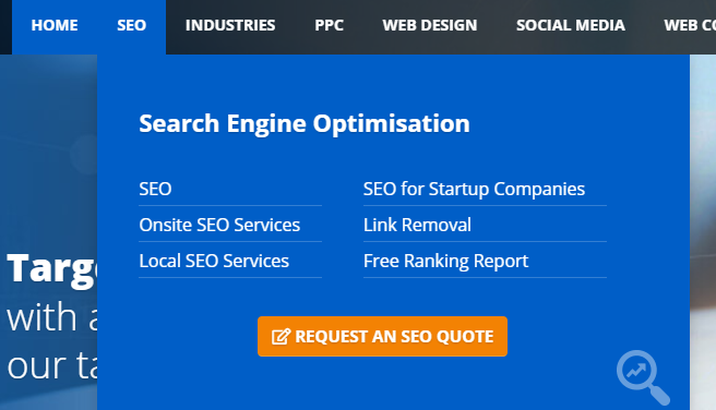
Everybody loves a Mega Menu – and we’ve made good use of this popular navigational format to make finding the right information incredibly straightforward.
Archived posts can be tracked down in a matter of seconds thanks to our revamped blog section. The new search facility allows for easy browsing, too.
And our new-look live chat facility is waiting in the wings for customers who want quick answers to their burning questions.

It’s Over To You!
We would love to hear your thoughts on our new website, so please get in touch with your own opinions! Leave your feedback via our Twitter and Facebook pages, or email us!


